How successful e-commerce sites adapt their product filters to reflect the users' mental shopping lists

October 16, 2018
Too much choice can overwhelm and discourage us—especially when we are confronted with a large product range and have no easy solution to filter the results according to our mental shopping lists.
During usability tests we often observe the “paradox of choice” behavior pattern, i.e. that a larger or excessively large selection of products reduces the desire to buy.
Maybe you’ve felt this way before?
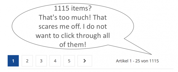
You end up on an overview page with a flood of products. Phew! How can you orient yourself? You have a product in mind for a specific purpose, but there are no suitable filter options to make a meaningful restriction. Slowly but surely, your patience reaches its limits. After scrolling through endless pages of results and clicking repeatedly to reach product pages, nobody wants to figure out that the item does not fit his or her desired purpose.
Adjust filter options to suit the “mental shopping list” of users
Shoppers usually have some idea of what products they are seeking. We call this the “mental shopping list.” This list contains important key data, as well as inclusion and exclusion criteria for the desired products. It can vary considerably, depending on the information stage, the type of product, or the shopper.
Often, a notable discrepancy exists between the criteria on this mental shopping list and the filters offered in online stores.
On one hand, we have the “language” of the visitors. In many cases, it is not congruent with the technical terms used on websites.
On the other hand, we have the filters offered in online shops, which are usually classified according to industry-standard categories. These often do not meet the criteria that are important to shoppers.
How Megaparkett makes filters easier to understand for its visitors
Megaparkett is Austria’s largest online store for branded hardwood floors. To facilitate the selection process in their wide range of products, they offer a number of filters. As part of our optimization project with Megaparkett, we focused a lot of energy on improving these filters.
In the first step, we adapted the existing filters to the users’ language.
For example, the industry’s common descriptions “lively,” “natural,” and “quiet” (this is how the look of parquet flooring is described) have not always been clearly understood.
We conducted several usability tests and heard many statements similar to the following:
“It would make it easier for me if I knew
what’s behind those individual categories.“
So we added additional explanations with tooltips:
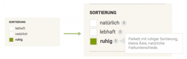
Example: How we made the filters easier to understand by adding tooltips at megaparkett.at (e.g. explaining in more detail what the term “quiet” (“ruhig” in German) means).
How Megaparkett introduced new filters based on user feedback
In the second step, we determined which filtering needs in the search for perfect parquet floors were not being covered by the existing filters. Usability testing helped us to better understand the mental shopping lists of hardwood-floor seekers.
Again and again, we observed how users lacked important exclusion criteria in the predefined filters. This fact annoyed the shoppers, since they wanted to have set their desired criteria with the filters instead of finding out on the product pages whether the desired criteria did or did not apply:
“I do not want to have to look in there if the hardwood floor
is not compatible with underfloor heating.”
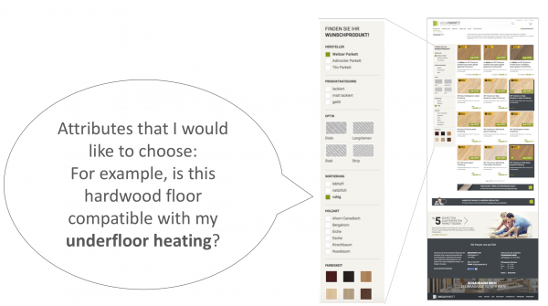
Example: Usability tests at megaparkett.at have shown that key decision criteria of hardwood-floor seekers were not reflected in the filters.
The usability tests have clearly shown that users are looking for very practical things, such as
- whether underfloor heating is compatible with a particular floor;
- which floor is suitable for a kitchen and living room combination; and
- which floor is recommended for pets.
On the basis of this feedback, the filters were supplemented with additional options that contained the exact words that went through the shoppers’ minds.
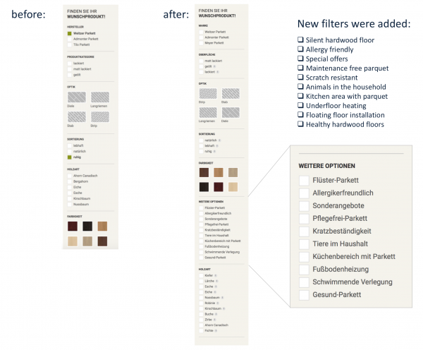
Example: How we have added the filters according to the shoppers’ mental shopping lists at megaparkett.com.
An often underestimated way to optimize e-commerce pages
Our usability tests consistently show how missing or inappropriate filtering options lead to frustration and site abandonment.
Product filters frequently do not “speak” the language of the website visitors. In-house categorizations or industry jargon are not understood. Important filter options are often missing from the selection list.
Our recommendation:
When you conduct usability tests, pay particular attention to the users’ filtering behaviors.
- Which key words do visitors use when searching for their products?
- Which selection criteria are missing, resulting in users searching for them in vain?
- Are there technical terms that are not understood?
Bonus tip: Use heat maps to determine which filters are used most often.
Contact us if you’d like us to help you better understand your users and optimize your business.
Subscribe to our newsletter to receive more case studies, user research insights, and free tips.