"Coupon code? I don't have one” - how a tiny box at checkout can ruin conversions

January 23, 2017
A big part of our job is running user tests. We’ve conducted user research on five continents across more than 20 industries. Over time we’ve noticed that one tiny box in the checkout always seems to trigger the same reaction in visitors.
We are talking about the field in the checkout of eCommerce shops where shoppers can enter coupon codes (also called voucher, promo or discount codes) – provided they have one.
Last-minute frustration for shoppers ready to buy
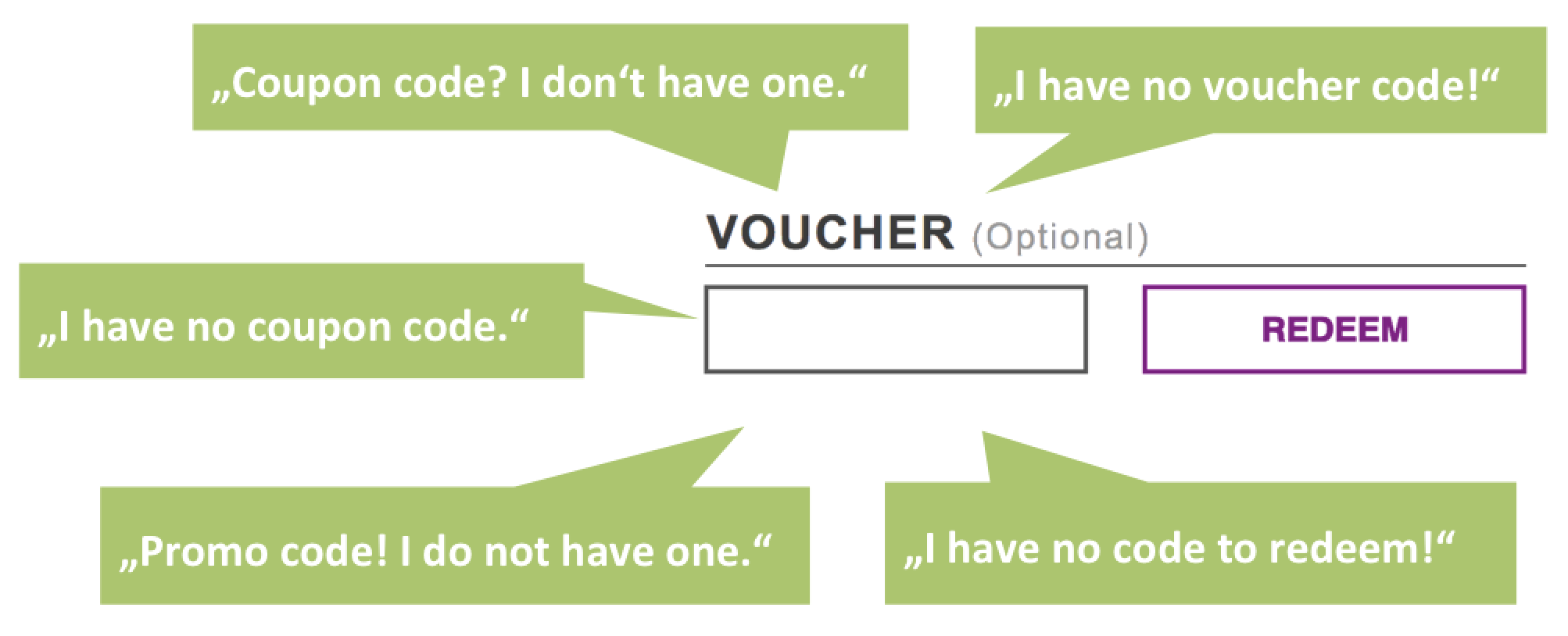
As soon as visitors without promo codes notice the entry field, they typically voice their disappointment: “Coupon code? I don’t have one!”
Maybe you’ve even felt this way before?
An uncomfortable thought pops in your head: Am I getting the best deal? A feeling of relative loss overcomes you as you think that others with coupon codes are getting a better price. Like many other visitors, this little box may prompt you to abandon the checkout to search for codes instead of clicking on the buy button.
Some may find a better offer, whereas others will simply postpone their purchase decision. This is especially bitter: losing a buyer at the very end of the sales funnel.
There are different tactics for counteracting this phenomenon. We will explain two today:
1. Display the coupon entry field less prominently to avoid negative reactions
2. Explain proactively how to get codes on your own site to prevent abandonment
Less prominent display of the coupon-code entry box
One way to make the code entry less prominent is to hide the promo box and its attention-grabbing companion, the call-to-action button “redeem promo code.” Instead of immediately displaying them, make them only appear upon clicking on a link.
The assumption behind this is: Visitors who have a code will actively search and find the entry area. Those without a code will be less aware of a potentially missed discount opportunity.
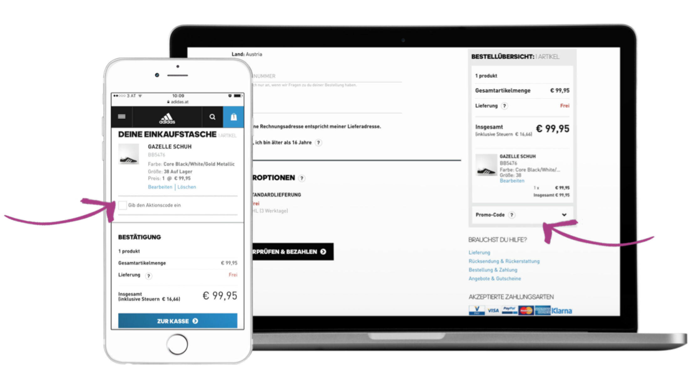
adidas takes this approach: They only display the coupon entry field in a second step.
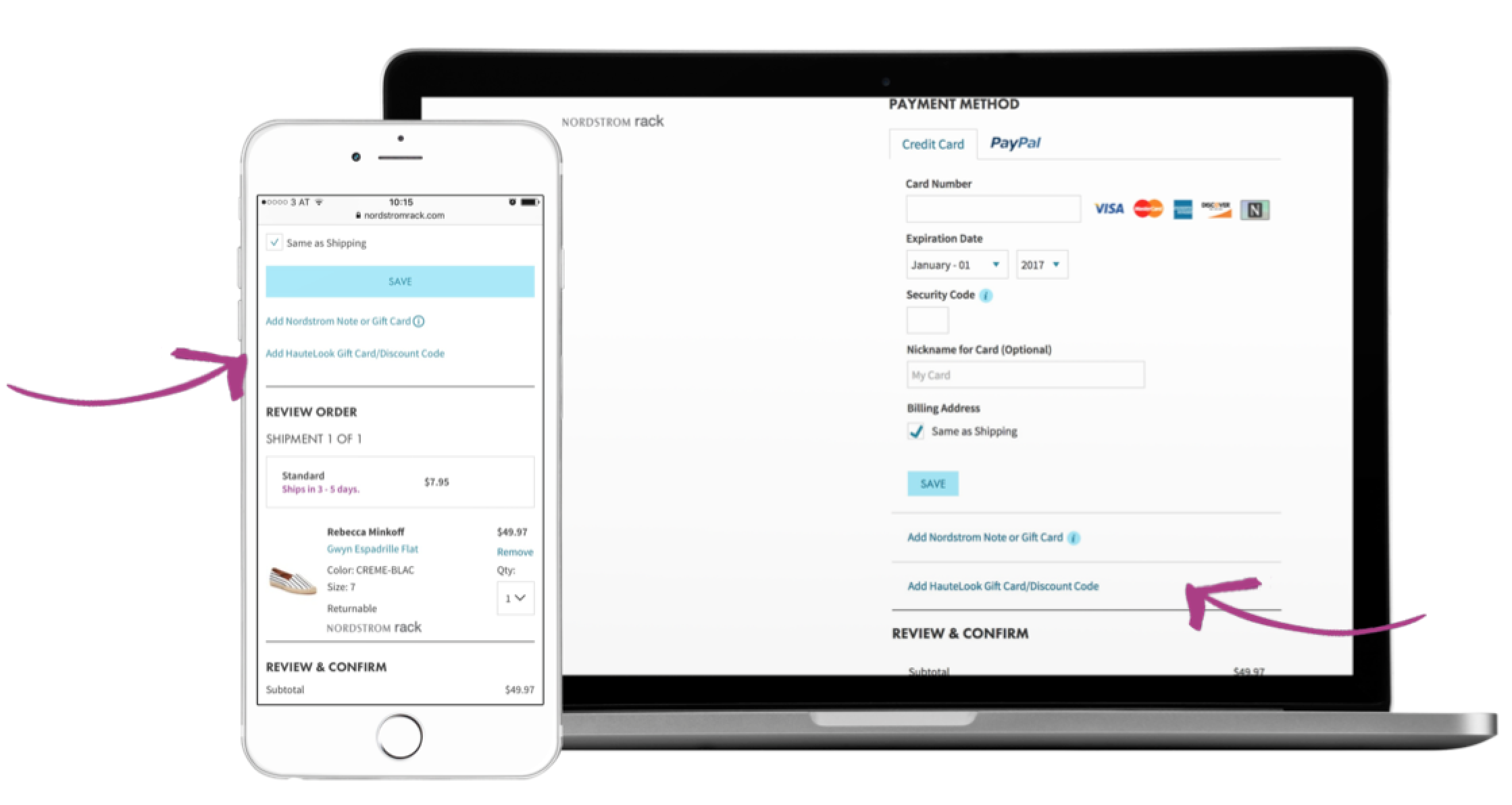
Nordstrom Rack does not display the entry field right away and “buries” the link in a list of links.
Another option is to show the box right away but to make it less noticeable, e.g. by placing it below the fold or in an area that gets less attention.
Proactive hint where to find codes on your own site
A completely different way to keep visitors from abandoning your site at the last minute in their search for codes is to tell them directly at checkout where to find codes.
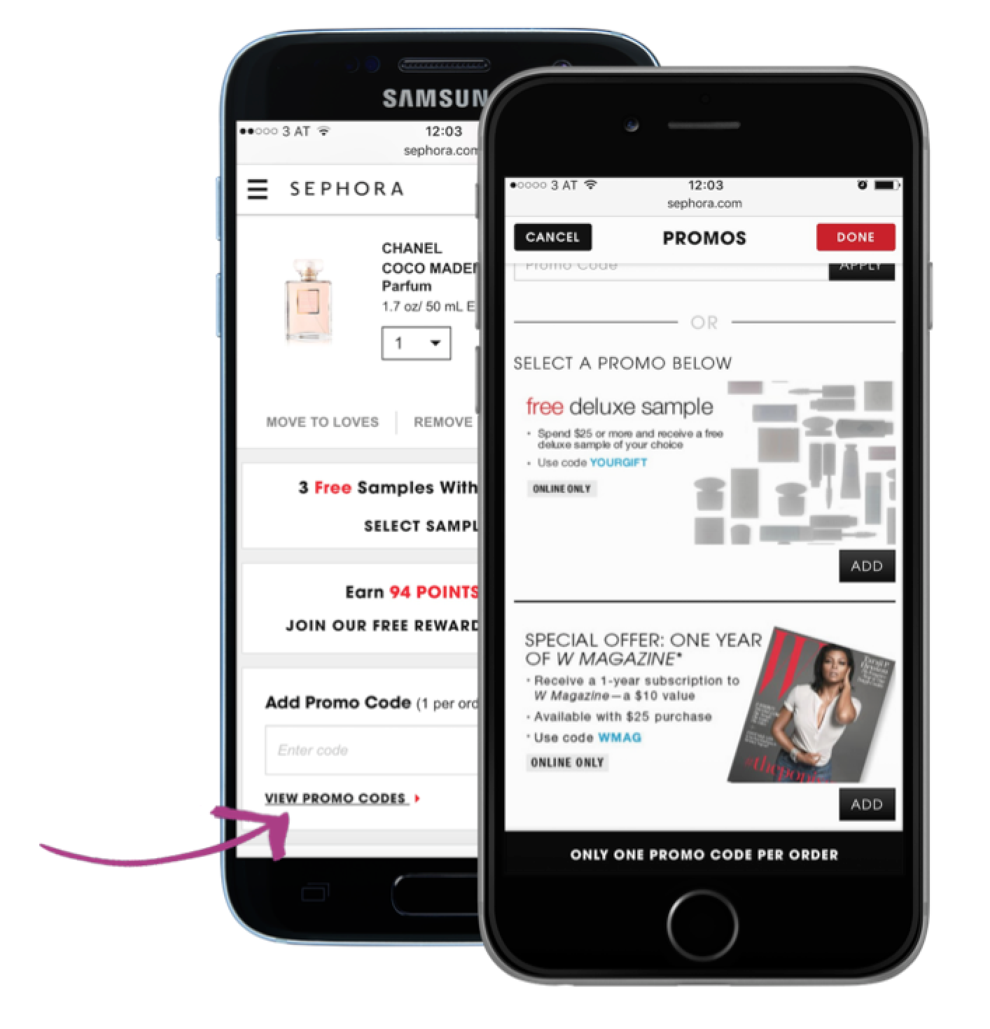
This is how Sephora keeps visitors on their site: They place a link below the code entry field, which directs to another page on Sephora’s own Web site where promo codes and information regarding special offers can be found and even added to the order.
Zappos pursues another interesting strategy. Users searching for Zappos coupons on Google quickly land on a site from the retailer itself, where they explain that there are no Zappos codes to be found on other Internet sites, for Zappos does not offer codes to the general public.
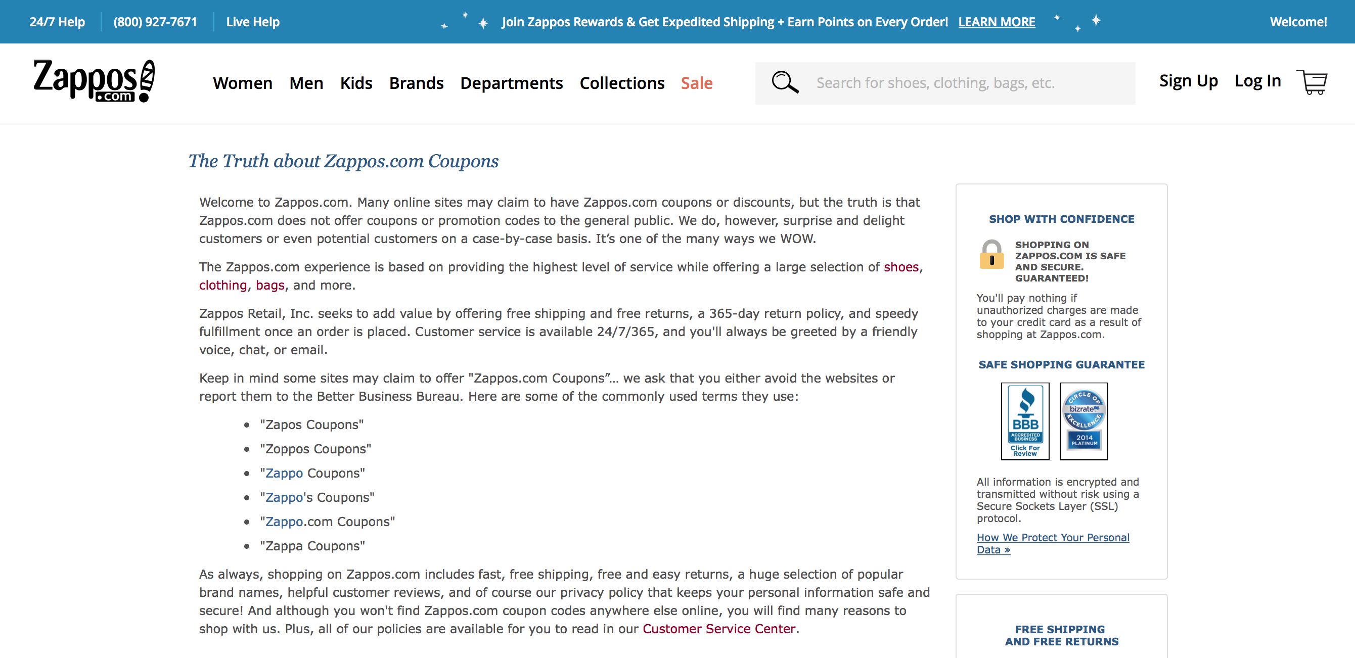
On their own site Zappos explains (via a dedicated page “The Truth about Zappos.com Coupons”) that they do not offer promo codes to the general public, advising shoppers not to waste time searching for codes. On the same page, Zappos points out other benefits they offer, such as free shipping and free returns.
Wrapping it up: it’s worth A/B testing different versions of the coupon box in the checkout
This entry field is a critical element that can shift your customers’ emotions at the very end of the sales funnel. It can even ruin your sale at the last second.
That’s why we recommend testing different strategies for this important element. A/B tests will help you find out which version works best for your target group.