3 UX Lessons Learned: Must-Haves for a High-Converting Mobile Shop

February 23, 2015
Over the past few months we’ve conducted lots of user tests on m-commerce sites across different industries. The main lesson we’ve learned from all this research is that mobile shoppers tend not to tolerate time-consuming user experiences. They want to get a task done. Hassle free.
For this article, we’ve picked out 3 areas that have a direct impact on mobile shopping conversions due to shoppers losing patience. Check them out and gain inspiration to perfect your mobile user experience.
Mobile Shoppers Want It Short & Snappy
Based on research we’ve done, mobile shoppers are looking for:
1. a clear entry point
Visitors who land on your home page (or any other landing page) and don’t immediately know what to do next will be gone in seconds.
A typical behavior we’ve observed is that users rapidly scroll down the homepage — as if they want to get a quick overview of what’s there. If they don’t instantly spot what to do to complete their intended task (browse for products, make a purchase, compare prices), they’ll abandon the site and look elsewhere.
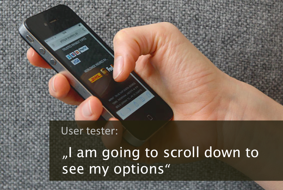
Most users scrolled down and up the entire home page when they first landed on it, a behavioral pattern they often describe as “getting an overview of my options.”
We noticed that displaying category options directly on the home page often helps users orientate themselves, get a quick overview of options and find an easy way to select what to do next.
2. a rescue anchor in case they get lost
Visitors who get stuck and cannot find what they are looking for typically tap on the menu icon assuming this will help them navigate to the desired product, category or content. While we were not surprised that the menu acts as a rescue anchor for stranded visitors, we were amazed that many online shops have a poor navigational menu. Contrary to the shoppers’ expectation, some sites don’t list their categories in their main menu (or offer an option to reach the categories). At that point, many frustrated shoppers give up, leave and go visit a competitor’s site instead.
Apart from the top menu (that little three-lined thing often referred to as the “hamburger”), a “shop” navigation element can help users find the categories they are looking for.
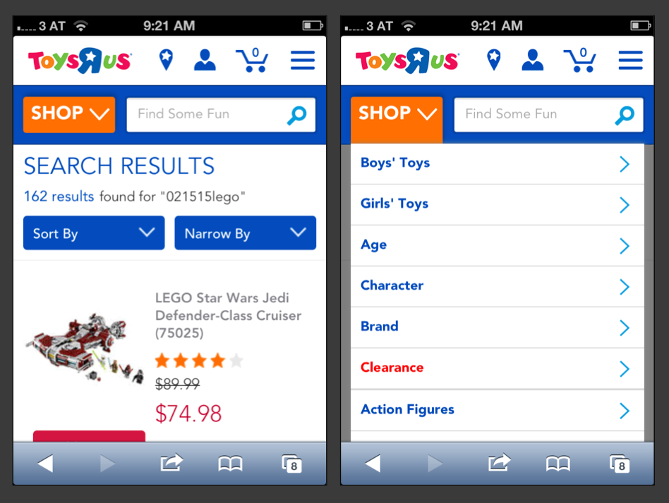
In this case, an additional navigation element, like the “shop” menu, helps users navigate to categories and quickly find their way around.
3. help to rapidly narrow down their selection
Shoppers who land on category pages with very long lists and not enough refinement options tend to get impatient. They want to narrow down their selection speedily. A lack of filters and sort options are one of the major sources of frustration we observed.
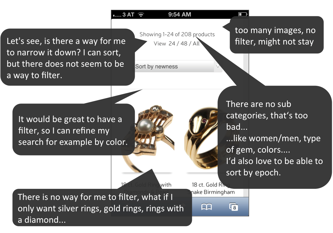
Statements from testers who tried to narrow down their choices on a category page without success.
Main Take-Aways
1) Provide visitors with a perfect start: make it crystal clear for them on the entry page what they need to do next to accomplish the task at hand (e.g. with well-defined categories and simple call-to-actions).
2) Make it easy for visitors to find their way around at any time. Don’t forget to include categories in the main menu to facilitate browsing.
3) Display filters prominently on your category pages and make sure to offer the right options.
PS: Are you planning to do some user testing?
Some of the tools we like to use for mobile user tests (following the “think aloud” protocol) are: usertesting.com, rapidusertests.com and MrTappy.
Contact us if you’d like us to run mobile user tests for you.
PPS: Stay tuned, we’ll soon post more about other mobile research tools we use to get user feedback on mobile devices.