SOS after unsuccessful website relaunch (or how to avoid failed attempts)

November 30, 2016
“Help! We’ve spent a fortune on the redesign of our new website, and now we have 30% less orders than before.”
More and more frequently companies turn to us in despair because they are unhappy with the outcome of the relaunch of their website. In the worst cases, they not only failed to reach the set goals but had to record a drastic conversion and revenue decline.
Why do relaunches sometimes turn into a complete flop?
There are numerous reasons why relaunches can go wrong. In our experience, a lack of truly understanding one’s users is one of the most common mistakes.
Surprisingly, relaunches are often carried out with barely any user research or behavioral analysis completed. Without this essential groundwork there is no strong base for reworking your site.
Before any relaunch you should have rock-solid answers to the following questions:
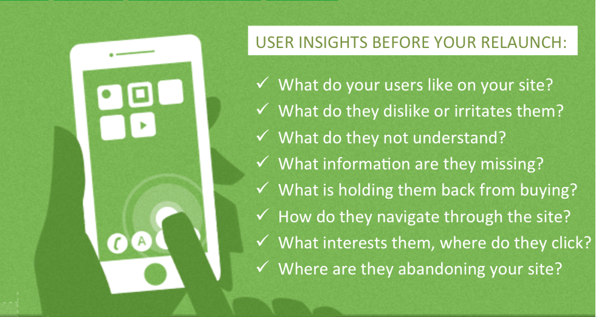
Questions that should be answered before working on your relaunch. Behavioral analysis and user feedback will help you get these answers.
If you cannot answer these questions, it will be hard to develop a new, better version of your website. The insights you gather during your user research and data analysis should be a key component of the briefing to the agency in charge of designing your new website.
No relaunch without truly understanding your users
The up-front investment in user research pays off many times. A relaunch based on solid user insights instead of mere gut feeling will save you a lot of time and resources later on. It will make it much easier for your agency (and cheaper for you) to tailor your new website exactly to your customers’ needs. Also, it will help you avoid unnecessary feedback loops and pointless internal discussion. On top of that, you’ll ensure from the beginning that your newly developed website responds effectively to your customers’ requirements.
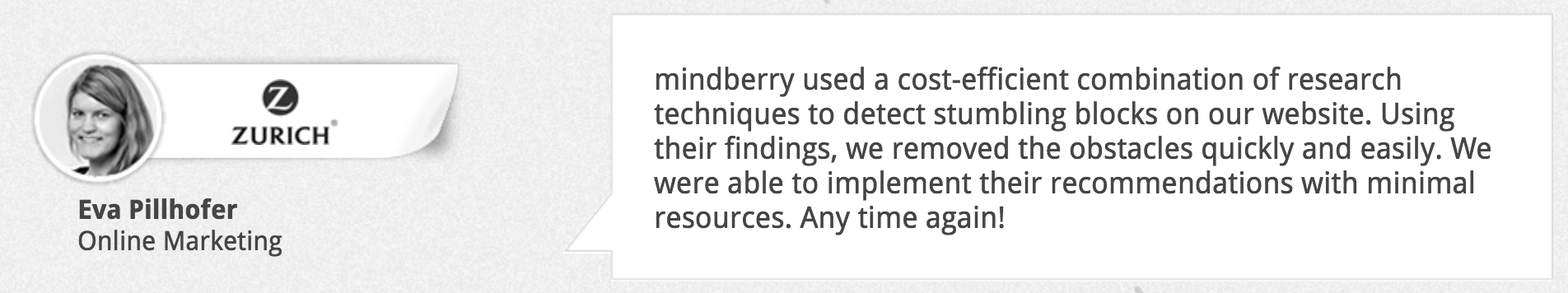
Zurich Insurance was well aware of how important user insights are for adapting its website. Solid user research allowed the company to focus on the right elements and most effective changes.
Like many other of our clients, Zurich Insurance was surprised how simple and cost-effective it is to conduct user research:
Often when we accompany relaunch projects, we notice that there are hefty internal discussions on how the navigation should look. With a small example from Zurich Insurance, we want to demonstrate how easy it is to find the right solution with user insights and how minimal changes can have a huge impact on the user experience:
User tests on zurich.at revealed that people looking for retirement insurance had difficulties finding the right submenu item under the menu item “retirement & savings.” Thus, they were not able to grasp what retirement insurance options are offered.
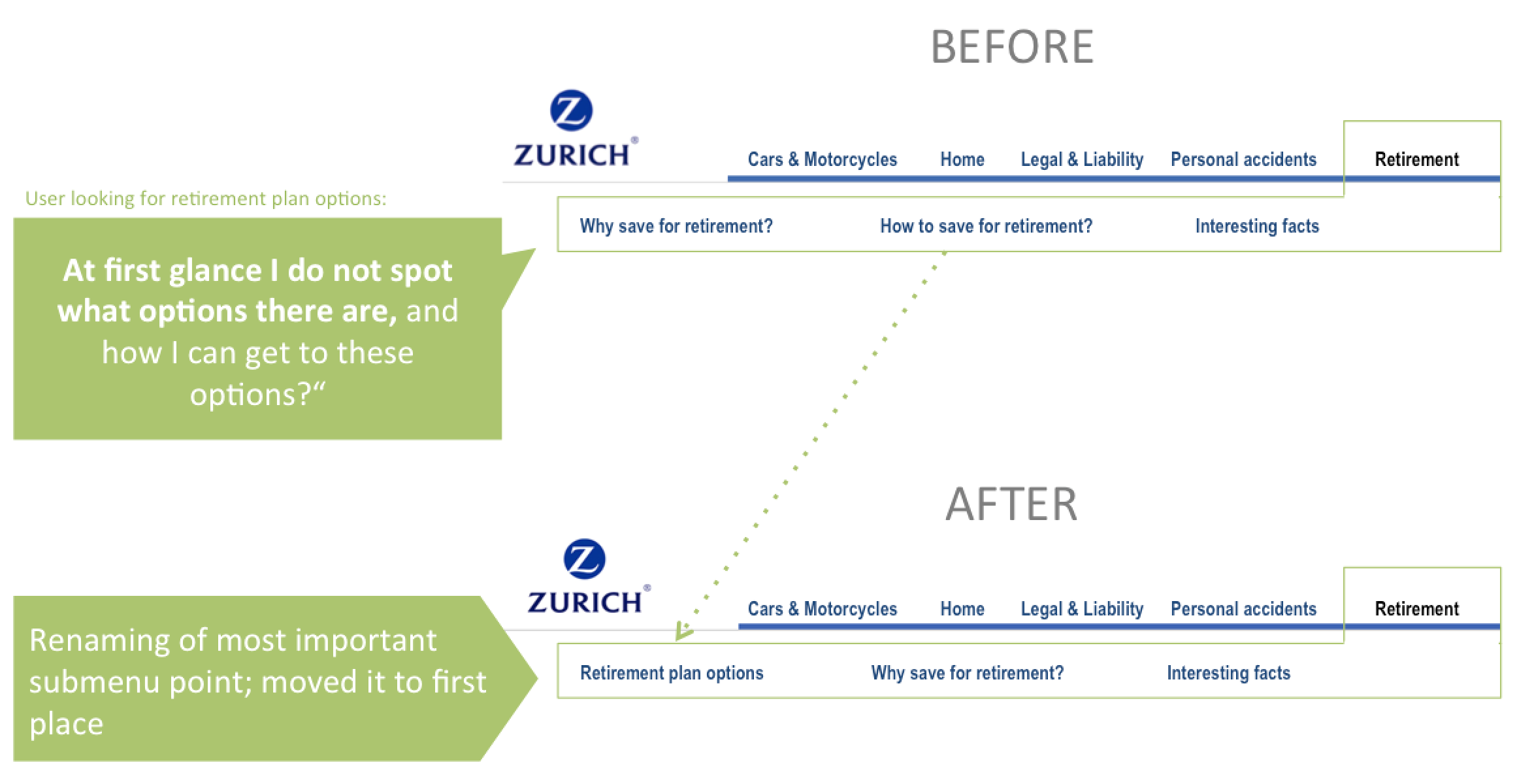
Among other insights, the user tests showed that “how to make provisions” was a confusing title for the underlying menu items. That’s where the retirement plan options were “hidden” — basically the information everybody was looking for but oversaw due to the confusing title. User testers were mumbling in despair during their unsuccessful search: “Where do I find retirement plan options?” We then used their very own words and renamed the submenu title “retirement plan options.” Very often small changes like this can have a huge impact on the user experience.
So, in case it is not too late, take time for some user research before redesigning your website. If you are tight on time, try at least to conduct a handful of user tests.
Here a few tips on how to easily gather insights about your visitors:
7 user research techniques that also work on low-traffic sites
Get out of the research lab: test mobile user behavior in real life situations
6 ways to capture priceless customer insights with in-the-moment feedback
SOS! What do you do when your relaunch was not successful?
Is the new site live and the results leave much to be desired?
Don’t despair! Behavioral analysis and user research can point you to the elements that do not work on your new pages. Often, it is not necessary to dismiss the whole relaunch. Instead, you can make small tweaks to remove conversion barriers. In many cases it is not the big design changes that boost the business but rather, razor-sharp tweaks tailored to the specific needs of your customers. As demonstrated with the example of Zurich insurance, even single words can make a huge difference.
By the way, a website is never really “finished”
A website will rarely be perfect on the first attempt. Good websites require constant user feedback and analysis as well as an iterative process and hypothesis-driven testing culture. Split tests (e.g., with platforms like VWO or Optimizely) help test new variations of your website to evaluate your hypotheses. Internet giants like Amazon and eBay optimize their pages on an ongoing basis without users taking much notice of the continuous, small changes.
Smaller websites lacking enough traffic for statistically significant split test results can get a better feeling for how new page elements work with before-and-after user research.
We can conduct user research before your relaunch or help you turn around an unsuccessful attempt
– Contact us if you’d like us to help you better understand your users and optimize your business.
– Subscribe to our newsletter to receive more case studies, user research insights, and free tips.